HTML+CSS填坑与挖坑
#1 物理1px边框问题
原因:最主要的原因就是设计分辨率和设备分辨率有差造成的,比如设计稿为750px宽,1px边框线,但是在实际设备中,可能宽为375px,那么我们的边框线需要设置为0.5px。对于retina屏上仅仅显示1物理像素的边框。一般的,Retina 屏的device-pixel-ratio >= 2
解决方案:
1.通过device-pixel-ratio适配
devicePixelRatio(缩写dpr)的准确含义是1个逻辑像素(px)需要使用几个物理像素来绘制,比如dpr = 2,代表1px需要2个物理像素绘制展现。
(设备物理像素和设备独立像素的比例)比例系数为2,边框线0.5px;比例系数为3,边框线0.3333px。
1
2
3
4
5
6
7
8
9
10
11
| .border { border: 1px solid #999 }
@media screen and (-webkit-min-device-pixel-ratio: 2) {
.border {
border: 0.5px solid #999
}
}
@media screen and (-webkit-min-device-pixel-ratio: 3) {
.border {
border: 0.333333px solid #999
}
}
|
但是对于某些设备,并不能直接处理0.5px的边框,于是
2.伪类 + css缩放
1
2
3
4
5
6
7
8
9
10
11
12
13
14
15
16
17
18
19
20
21
22
| // 此处加前置条件判断是否为Retina屏幕
@media screen and (-webkit-min-device-pixel-ratio: 3) { /// }
.scale{
position: relative;
margin-bottom: 20px;
border:none;
}
.scale:after{
content: '';
position: absolute;
top: 0;
left: 0;
border: 1px solid #000;
-webkit-box-sizing: border-box;
box-sizing: border-box;
width: 200%;
height: 200%;
-webkit-transform: scale(0.5);
transform: scale(0.5);
-webkit-transform-origin: left top;
transform-origin: left top;
}
|
3.viewport + rem 实现
同时通过设置对应viewport的rem基准值,这种方式就可以像以前一样轻松愉快的写1px了。
1
2
3
4
| // 在devicePixelRatio = 2 时,输出viewport:
<meta name="viewport" content="initial-scale=0.5, maximum-scale=0.5, minimum-scale=0.5, user-scalable=no">
// 在devicePixelRatio = 3 时,输出viewport:
<meta name="viewport" content="initial-scale=0.3333333333333333, maximum-scale=0.3333333333333333, minimum-scale=0.3333333333333333, user-scalable=no">
|
具体可参照下面的文章操作
https://www.cnblogs.com/ssh-007/p/7213792.html?utm_source=itdadao&utm_medium=referral
在改变了viewport之后,相当于将页面所有元素整体缩放了x倍,若此时的1px代表1物理像素,可能在设计稿中的2px是代表4个物理像素,此时,依旧使用px显然不能达到设计效果。
引用rem
我们知道,1rem等于html根节点下的font-size的px值,我们只需要将html下的font-size重新设定为我们需要的px,便可使用rem代替viewport改变之前的px使用,那么,如何让1rem对应到原始的1px?
若适配dpr = 2的屏幕,我们将viewport缩放设置为0.5,那么此时1px代表1物理像素,若要使用原始的1px代表的2物理像素,需要
1px * 2 = 1px * dpr = 物理像素 * dpr = 逻辑像素
此时,逻辑像素被还原到初始代表的物理像素值,我们用rem来表示就是1rem = (需求的逻辑像素)*dpr
若原本设计字体大小为16px,此时只需要将字体大小设置为16*2 = 32px即可。之后,使用1rem代表。
#2 外边距塌陷问题
外边距塌陷也称为外边距合并 是指两个在正常流中相邻(兄弟或父子关系)的块级元素的外边距 组合在一起变成单个外边距
不过只有上下外边距才会有塌陷 左右外边距不会出现这种问题
涉及到块级元素的外边距塌陷,分为下面的三种情况,已经有稳定的解决方案,使用时对号入组
1.垂直排列的兄弟块级元素
当上下相邻的两个块级元素相遇,上面的元素有下边距margin-bottom,下面的元素有上边距margin-top,则它们之间的垂直距离取两个值中的较大者
1
2
3
4
5
6
7
8
9
10
11
12
13
14
15
16
17
18
19
20
| <head>
<style>
.box1 {
width: 150px;
height: 100px;
margin-bottom: 20px;
background-color: #000;
}
.box2 {
width: 100px;
height: 100px;
background-color: red;
margin-top: 10px;
}
</style>
</head>
<body>
<div class="box1"></div>
<div class="box2"></div>
</body>
|
此时,两个盒子的间距是20px,而不是30px
解决办法:灵活处理,合理使用上下边距,达到符合需求的间距
2.嵌套块级元素
对于两个嵌套关系的块元素,如果父元素没有上内边距及边框,父元素的上外边距会与子元素的上外边距发生合并,合并后的外边距为两者中的较大者
1
2
3
4
5
6
7
8
9
10
11
12
13
14
15
16
17
18
19
20
21
22
23
24
25
| <head>
<style>
.box1 {
width: 150px;
height: 100px;
margin-top: 20px;
background-color: red;
}
.box2 {
width: 100px;
height: 100px;
background-color: #000;
margin-top: 10px;
}
</style>
</head>
<body>
<div class="box1">
<div class="box2"></div>
</div>
</body>
|
这时候两个盒子会发生合并,上外边距为20px。
解决方案:
给父元素定义上边框
给父元素定义上内边距
给父元素添加 overflow:hidden;
添加浮动
添加绝对定位
3.空的块级元素自身外边距塌陷
如果存在一个空的块级元素,border、padding、inline content、height、min-height都不存在,那么上下边距中间将没有任何阻隔,上下外边距将会合并
1
2
3
| <p style="margin-bottom: 0px;">这个段落的和下面段落的距离将为20px</p>
<div style="margin-top: 20px; margin-bottom: 20px;"></div> //--空的块元素
<p style="margin-top: 0px;">这个段落的和上面段落的距离将为20px</p>
|
可以理解成中间div宽度为0且上下边距融合,只取margin的最大值。
#3 BFC问题
BFC(Block formatting context)直译为”块级格式化上下文”。它是一个独立的渲染区域,只有Block-level box参与, 它规定了内部的Block-level Box如何布局,并且与这个区域外部毫不相干。
1.BFC的布局规则
内部的Box会在垂直方向,一个接一个地放置
Box垂直方向的距离由margin决定。属于同一个BFC的两个相邻Box的margin会发生重叠
每个盒子(块盒与行盒)的margin box的左边,与包含块border box的左边相接触(对于从左往右的格式化,否则相反)。即使存在浮动也是如此。
BFC的区域不会与float box重叠
BFC就是页面上的一个隔离的独立容器,容器里面的子元素不会影响到外面的元素。反之也如此
计算BFC的高度时,浮动元素也参与计算
2.如何创建BFC
满足以下任意一条就可创建一个BFC渲染区域
float的值不是none
position的值不是static或者relative
display的值是inline-block、table-cell、flex、table-caption或者inline-flex
overflow的值不是visible
3.BFC的作用
1. 解决外边距塌陷问题
根据布局规则的第2条可知,同一个BFC渲染区域会存在边距塌陷问题,只需要创建出多个不同的BFC区域便可解决塌陷问题。
- 对于兄弟块级元素存在的边距塌陷
1
2
3
| // 存在边距塌陷问题
<div style="height: 100px;width: 100px;margin-bottom: 10px;"></div>
<div style="height: 100px;width: 100px;margin-top: 20px;"></div>
|
创建一个新的BFC
1
2
3
4
5
| // 利用BFC规则解决边距塌陷问题
<div style="display: flex;"> // 创建新的BFC
<div style="height: 100px;width: 100px;margin-bottom: 10px;"></div>
</div>
<div style="height: 100px;width: 100px;margin-top: 20px;"></div>
|
- 对于父子块级元素存在的边距塌陷
1
2
3
| <div style="height: 300px;width: 100px;margin-top: 10px;">
<div style="height: 100px;width: 50px;margin-top: 20px;"></div>
</div>
|
创建一个新的BFC
1
2
3
4
5
| <div style="height: 300px;width: 300px;margin-top: 10px;">
<div style="display: flex"> // 为子块创建一个新的BFC区域
<div style="height: 100px;width: 50px;margin-top: 20px;"></div>
</div>
</div>
|
2.清除浮动
对于内含浮动元素的父元素
1
2
3
4
5
6
7
8
9
10
11
12
13
14
15
16
17
18
| <style>
.parent{
border: 1px solid #000;
width: 300px;
}
.child{
border: 2px solid #777;
width: 80px;
height: 100px;
}
</style>
<body>
<div class="parent">
<div class="child"></div>
<div class="child"></div>
<div class="child"></div>
</div>
</body>
|
当我们不给父节点设置高度,子节点设置浮动的时候,会发生高度塌陷,这个时候我们就要清除浮动。
依据计算BFC的高度时,浮动元素也参与计算规则
1
2
3
4
5
6
7
8
9
10
11
12
13
14
15
16
17
18
19
20
| <style>
.parent{
border: 1px solid #000;
width: 300px;
overflow: hidden; // 设置overflow,激活BFC
}
.child{
border: 2px solid #777;
width: 80px;
height: 100px;
float: left;
}
</style>
<body>
<div class="parent">
<div class="child"></div>
<div class="child"></div>
<div class="child"></div>
</div>
</body>
|
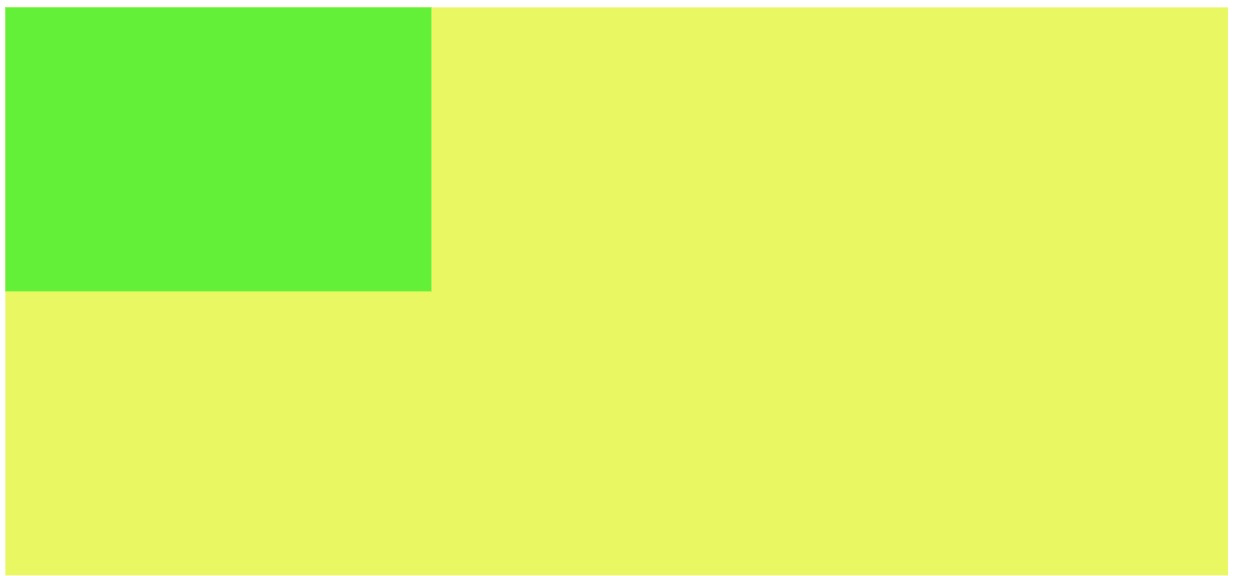
3.实现自适应两栏布局
1
2
3
4
5
6
7
8
9
10
11
12
13
14
15
16
| <style>
.left{
background: rgb(91, 243, 30);
width: 300px;
height: 200px;
}
.right{
background: rgb(233, 250, 84);
height: 400px;
}
</style>
<body>
<div class="left"></div>
<div class="right"></div>
</div>
</body>
|
以上设定依照每个盒子(块盒与行盒)的margin box的左边,与包含块border box的左边相接触(对于从左往右的格式化,否则相反)。即使存在浮动也是如此规则
此时,将右侧盒子另起为新的BFC空间容器,得到
1
2
3
4
5
6
7
8
9
10
11
12
13
14
15
16
17
| <style>
.left{
background: rgb(91, 243, 30);
width: 300px;
height: 200px;
}
.right{
background: rgb(233, 250, 84);
height: 400px;
overflow: hidden;
}
</style>
<body>
<div class="left"></div>
<div class="right"></div>
</div>
</body>
|
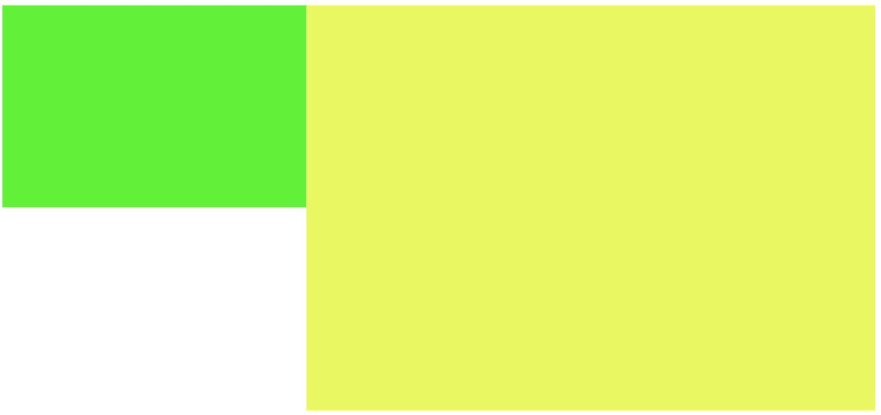
这样便形成了左侧固定宽,右侧自适应宽度布局
BFC就是页面上的一个隔离的独立容器,容器里面的子元素不会影响到外面的元素。反之也如此。
###


